XML, DTD, RDF, TEI, URL, URI…WTF?

Apologies for the ultimately rude title but all these abbreviations can make your head spin. I am familiar with some of them from before but after a while when using so many I forget not just what the full names of these terms are but also what they actually mean? Ironic really as this blog is all about semantics. Semantic web. Giving web content meaning. Web 3.0?

For this blog post we looked at The Artists Books online website to see how it was broken down in it’s xml form and more.

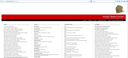
Homepage of website for ABO

Home page of Artists’ Books Online website

First I looked back at The Old Bailey Online’s mark up which you can see here:

screengrab of mark-up text from Old Bailey online

Old Bailey online mark-up text

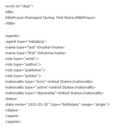
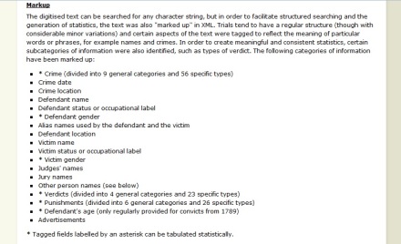
Then compared that to the Artists’ Books Online mark-up here:

Artists' Books Online mark-up text - sample.

Artists’ Books Online mark-up text – sample


This was in order to help me understand the different sets of text categories that the two different websites have marked up their data with.

Reading between the margins of books (and society).

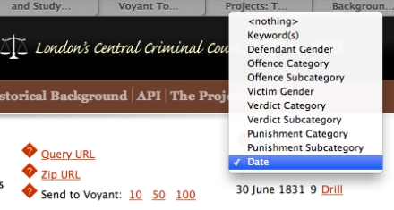
The Old Bailey API is structured so that you are able to search by trial, rather than by offence or defendant etc. It also allows you to look at the results in a bit more depth by “drilling down” by various sub categories as listed here:

screengrab of Old Bailey online API

   API categories for drilling down

Screen Shot 2014-11-30 at 18.30.27

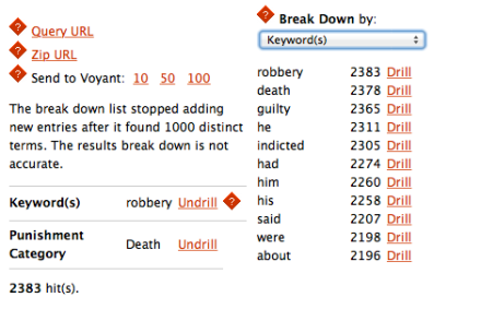
Drilling down with the category: “Keyword(s):” returns the following list of keywords occurring.


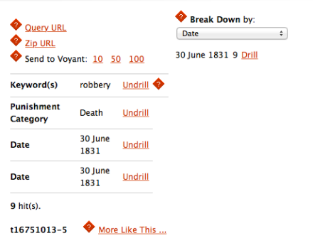
Drilling down further to date alone leaves you with 9 results to explore.

Drilling down further by “Date” leaves you with 9 results to explore.

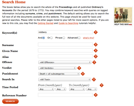
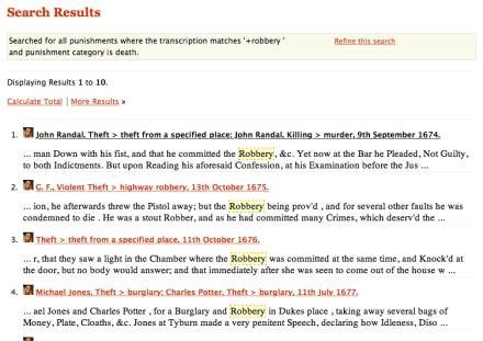
The original Old Bailey search allows for me to search things such as: Robbery and which were punishable by Death (any):

Screengrab of Old Bailey Online search

Old Bailey search query

I am able to refine this search here:

Screen Shot 2014-11-30 at 16.35.29

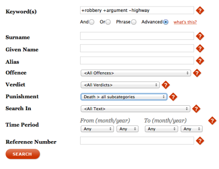
Which takes me back here to give me the option of clicking on more advanced options. Where I have chosen to search for all trials that contain BOTH the words “robbery” and “argument” but do NOT include “highway”:

Screen Shot 2014-11-30 at 18.37.04

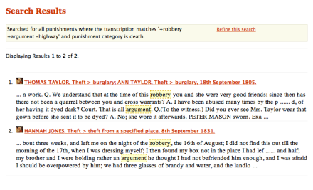
Here is the result returned of that more advanced search:

Screen Shot 2014-11-30 at 18.37.15

“robbery” plus “argument” minus “highway” = results returned.

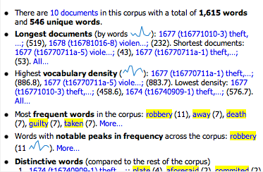
I exported my results from the Old Bailey API to Voyant Tools and it returned these results:

Screen Shot 2014-11-30 at 16.37.13

Most frequent words listed in Voyant result.

Screen Shot 2014-11-30 at 16.36.56

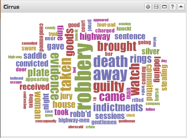
Voyant Word cloud in Cirrus of first Old Bailey search of “robbery” and all punishable by (any) death.

Which is why I had then tried a search in the original Old Bailey web search as to not include Highway, as that was one of the words that stood out in the Voyant word cloud:

One could argue that the advantages are the time-saving shortcut of having words “jump out at you” from a Voyant word cloud and see listed the frequency of certain words over others. And therefore also help pose questions that a researcher had not previously considered. But the liability of relying on this alone for research is that you might miss the context of why certain texts contain the word many times. It might happen to be a stylistic tick of the person who was recording the information for the Old Bailey records. Or there may have been a tendency at the time of the trial to place more emphasis on one element than another and it may not be as representative as a modern day stenographer’s text. So the text in itselt might only be so reliable to be representative for criminal history research. Whereas it might be very interesting to someone researching the way in which people viewed crime and the type of language used in documenting crime.

I chose the ABO (a digital archive of early modern annotated books) to look at from the Utrecht Text Mining project.

Screen Shot 2014-11-30 at 16.40.33

Website header of ABO – Annotated Books Online project.


The differences between the two projects is that ABO is data mining from many resources. Whereas the Old Bailey is data mining from one resource: The Old Bailey records. Also the ABO project encourages people to comment online on the annotations in the book to help further the research. It is an ongoing interactive project.

The Old Bailey project seems to be more about the content of the document as opposed to how that document was used which differs from ABO that they want to see what they can learn from the annotations made in the books themselves. And so it is more about the phyiscal document and what it can tell us when you see it has been used as a place to also make notes by the reader to the reader.

I chose the ABO project as I find the extra level of data mining interesting of not just scanning the main text but also literally reading between the lines (or in the margins). Considering what annotations made by readers in these books can tell us.

I think both these data mining projects support my understanding that any research should use a combination of qualitative and quantative research and that although the quantative tools we have been introduced to can throw up some interesting questions, it needs to be put into the context of what the original text that is being analysed is. And also that data mining can in itself create new texts that stand alone in their own right as a source of further research.

There’s more to text analysis than meets the eye

It was exciting to delve into the world of Text Analysis recently with the help of tools such as Wordle and Voyant. (I tried to have a play with Many eyes but it was very slow and took so long to get running, I am afraid I gave up for the time being). I’ll admit I always thought word clouds were “just a bit of fun” and until now haven’t appreciated the importance of their use in research. When reading Geoffrey Rockwell; “What is text analysis, really?” it got me thinking more about how the work doesn’t just stop once you have created one wordle.

“…With interactive tools and a more mature community of users we began to realize we could ask new types of questions that print concordances could not support. As we experimented with new questions we realized that one of the things that was important was this intellectual process of iteratively trying questions and adapting tools to help us ask new questions. We can do so much more now than find words in a string. We can ask about surrounding words, search for complex patterns, count things, compare vocabulary between characters, visualize texts and so on.”

It was this idea of the Wordle being only the beginning of research in that it can help prompt us to ask questions of our research.

But also it was important to see these visualisations and interpretations as new texts in themselves: “The hybrid texts generated by computers are new texts that can be called interpretations in that they belong to the class of texts which have a special relationship to an existing text. If we want to distinguish them from human interpretation we can call them interpretative aides…They are analytic in that, following Condillac, they are generated by processes of taking apart and putting back together information into new configurations for the purposes of discovery and reflection.”

This is what most interested me, that they help us reflect on what it is we think we will discover – our expected results and what we often do not expect to find.

But Geoffrey Rockwell points out that there can be constraints in their use: “The logic of the tools, despite (or because of) their tendency to become transparent in use, can enhance or constrain different types of reading which in turn makes them a better or worse fit for practices of literary criticism including the performance of criticism.”

So I suppose this has just taught me not to take this at face value that either all text analysis has to offer is throw up a nice emphasis on word occurences. But also to remember what it is I want to find out? What else I can ask of the results then merely ‘occurences’ and also is this particular tool the best tool for this particular research?

Below are some screengrabs of various results from Wordle and Voyant:

Having fun with Wordle for Cambridge Press journal publication altmetrics search:

Wordle: Cambridge Press journals

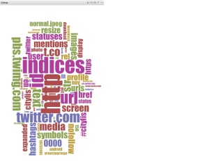
The #Citylis tag occurences on Twitter archive with Wordle:
Wordle: Citylis Twitter visualisation


Voyant screengrabs:

voyant summary list

voyant tools visualisation

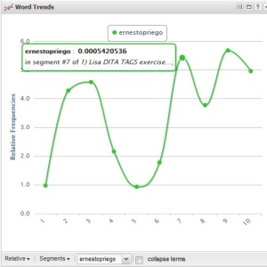
Voyant Word Trends

Voyant Word Trends2

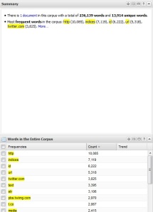
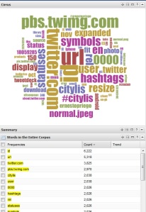
Trying cirus with stop words such as https and urls and unfollow etc. Returned these results:

Voyant web stop words used


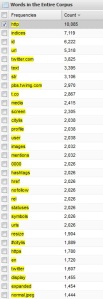
entire corpus words

Collecting data..for this post about altmetrics

For the purpose of learning more about altmetrics and how to use them I collected some quotes from the following journals:

Mendeley Readership Altmetrics for the Social Sciences and Humanities: Research Evaluation and Knowledge Flows by Ehsan Mohammadi and Mike Thelwall.  Visualization of Co-Readership Patterns from an Online Reference Management System by Peter Kraker, Christian Schlogl, Kris Jack and Stefanie Lindstaedt.


Mendeley Readership Altmetrics for the Social Sciences and Humanities: Research Evaluation and Knowledge Flows by Ehsan Mohammadi and Mike Thelwall. 

 “However, citation analysis is restricted to measuring the impact of publications from the author’s perspective, but an article could be useful in other contexts such as teaching, commercialization, and daily working life (Haustein & Siebenlist, 2011; Schloegl & Stock, 2004). In particular, citation metrics are more appropriate for the evaluation of theoretical publications than for applied research. Moreover, there is a worry that a new generation of authors could believe that “citation analysis is a waste of time because authors do not adequately cite those who have influenced their work” (Garfield, 2011, p. 2).”

“Journal usage metrics refer to indicators based on the usage data of electronic journals (Rowlands & Nicholas, 2007) that provide reasonable evaluation of the journals (Hahn & Faulkner, 2002), such as downloads or accesses. Similarly, readership has been defined as “full-text downloads” (Haque & Ginsparg, 2009, p. 2211) or “electronic accesses” of a particular article (Kurtz et al., 2005, p. 111). Usage statistics are able to capture broader research activities (Kurtz & Bollen, 2010, p. 27) and are obtainable earlier (Brody, Harnad, & Carr, 2006) than citation indicators.”

“Data collection for altmetrics can often be based on open applications programming interfaces (APIs; Priem, Piwowar, & Hemminger, 2012), which are faster and more accessible than classical usage data and are easy to integrate (Priem et al., 2011). Among Web 2.0 platforms, social bookmarking tools, such as CiteULike, Connotea, and BibSonomy, may help to overcome the lack of global and publisher-independent usage data (Haustein & Siebenlist, 2011).”

“The present research addresses this issue by assessing whether the relationship between Mendeley readership and citation counts varies across different social sciences and humanities disciplines. Social sciences and humanities studies are not cumulative and topics are not globally agreed in these disciplines (Becher & Trowler, 2001); thus citation analysis has more limitations for measuring the research performance of these areas than for the hard sciences (Nederhof, 2006).”


Visualization of Co-Readership Patterns from an Online Reference Management System by Peter Kraker, Christian Schlogl, Kris Jack and Stefanie Lindstaedt:

“With the advent of e-journals, digital libraries, and web-based archives, click and download data have been suggested as a potential alternative to citations (Kurtz et al., 2005; Rowlands and Nicholas, 2007). Compared to citation data, usage data has the advantage of being available earlier, shortly after the paper has been published. In many instances, usage statistics are also easier to obtain and collect (Bollen et al., 2005; Brody et al., 2006; Haustein and Siebenlist, 2011). Furthermore, usage statistics allow for an analysis of publications and research outputs that do not receive citations or for which citations are not tracked (Priem and Hemminger, 2010).”

“Therefore, we assume that co-readership can be used as a measure of subject similarity. Co-readership relation between two documents is established when at least one user has added the two documents to his or her user library (see Figure 1). The more often the same two documents have been added to user libraries, the more likely they are of the same or a similar subject. The topical relationship established by co-readership can then be exploited for visualizations by clustering those papers that have high co-readership numbers (see Figure 2). To the best of our knowledge, this measure has not been exploited before for knowledge domain visualization.”

“In social reference management tools we can go beyond mere usage: we are able to inspect the users’ library data. This is an improvement in several regards; _rst, we are able to use library co-occurrence from a single service as a basis for mapping the intellectual structure of a scienti_c domain. Second, being able to precisely attribute papers to individual readers allows for a better understanding of the results. With the help of pro_le information, we can furthermore analyze the inuence of di_erent geographic regions or career stages.”

“An analysis of the results shows that the visualization not free from biases. First, all of the papers are in English, even though educational technology is often researched by local communities that communicate in their native language (Ely, 2008). Second, the knowledge domain visualization represents an education-dominated view that lacks areas related to computer science. Biases in usage statistics analyses were _rst mentioned by Bollen and Sompel (2008) in a study of downloads in an institutional repository. The authors found great di_erences in the correlation of usage impact factor and journal impact factor depending on the user base. The authors therefore concluded that these biases occur due to sample characteristics.”

“At _rst, we analysed the geographical distribution of users. One of the reasons for the fact that all of the papers are in English is surely that English is the lingua franca in science and research (Tardy, 2004). But most likely, this dominance of English also stems from the fact that there is a strong bias towards English-speaking countries on Mendeley. This assumption is backed up by the results of the geographical analysis (see Figure 10). Out of 2,153 users, 927 (43.1%) have chosen to list a country in their user pro_le. In total, 70 countries have been named, but the distribution is highly skewed.”
Sharing my online presence

A few years ago I was emailing an old friend in Oslo about my increasing interest in coming to work in Norway. In order to help me out, unbeknownst to me, she posted information about me and my particular interest in getting a job in Norway on the equivalent of a Gumtree type of website in Norway. It is a kind of community site that contains forums for discussion, for selling things, advertising events and so on. Not long afterwards I was contacted about whether I would be interested in coming for a job interview in Oslo, after someone had seen what my friend had written where she had also posted a link to my online portfolio.

Coincidentally I was going to be in Norway in a week’s time so we arranged when I could come for an interview. In the days leading up to the interview, three of the people who worked at the company sent me a “follow request” on Twitter. I had created a Twitter account the year before and was using it partly for my own interests (following bands, typographers and designers I liked) but also so I could learn more about social media. But as it was new to me and for fun, I decided to keep it locked.

So was surprised when I received the requests from these three people at the company I was yet to have an interview with. I have never forgotten this as it struck me as the reason they did that before meeting me was to help flesh out an idea of what kind of person I was. To see if I would have interests (and possibly even a sense of humour) that would fit in with the rest of their team. I have never checked if this was the reason why but it did strike me as odd, as I thought: “what if the interview goes terribly and we don’t get on? Do they ‘unfollow’ me afterwards?” Luckily it went well and I worked with them for nearly 3 years. Whilst there I found out that one of my other colleagues had found out about his job in the same company via a tweet on Twitter. So when people sometimes wonder why I am on Twitter, amongst other reasons, I tell them those two stories about direct and indirect ways Twitter helped my colleague and I find employment. This personal experience is echoed by Amber K. Regis’ assertion in ‘Early Career Victorianists and Social Media: Impact, Audience and Online Identities’ (2012), that: “It is no longer a possibility but a very real likelihood that selection committees and appointment panels will Google the names of applicants. Rather than a drunken photo on a Facebook profile with inadequate privacy settings, how much better to discover a well-crafted online identity? Appropriate use of social media can help to make the right impression before setting foot in an interview room, setting you apart for all the right reasons.”

Since that experience I have become more aware of how networking and finding new jobs is increasingly being done through less conventional methods. People don’t exchange business cards at conferences they ask for your Twitter handle. Or look you up on LinkedIn. Amber K. Regis’ article: ‘Early Career Victorianists and Social Media: Impact, Audience and Online Identities’ (2012) mentions how a recognisable almost branded online presence has become increasingly important. “…Nicholson’s online self-fashioning is a fascinating study in academic identity as unique brand. Nicholson is the digital Victorianist; he has his own logo (a top hat and computer mouse), an author photograph (also in top hat) and an integrated Twitter account (@DigiVictorian)…Under the sign of the top hat and computer mouse, all things coalesce. Nicholson and Dobraszczyk thus forge very different online identities, but their sites share a common purpose: to promote and increase professional visibility.”

I have always had difficulty (as many graphic designers tend to) of being my own client and brand myself. But realising the importance of a clearly unified online presence I have finally settled upon a monogram type image to use on all social media. Much like Nicholson’s top hat and mouse mentioned by Amber K. Regis, I hope that my consistent use of the same image will help people remember what links my online presence to certain subject areas.

When I applied to study at City University London, I cited my use of Twitter and my interest in finding and sharing information as one of the many reasons I was so keen to learn more about the disciplines within Information Science. As I mentioned earlier, I originally began following typographers and designers (as well as bands) to keep up to date with interesting things happening in the design community to help me in my work. Very early on I created lists and followed other people’s lists that contained many interesting professionals in my field. And over the years I have edited by “following” or “unfollowing” organisations or professionals to enable me to get the most out of Twitter. As Amber K. Regis remarks in regards to how we interact with Twitter: “…you get the Twitter feed you deserve as its contents are dictated by the accounts you choose to follow. Ernesto Priego compares the academic use of Twitter to a process of curation: the careful selection of groups, organizations and individuals with whom you wish to interact:

If curated properly and if there is the honest will to share work, information and knowledge; to collaborate and interact beyond professional fears, envies and selfishness, a Twitter timeline can become a lively combination of seminar, workshop and library where academia is no longer preaching to the converted, and where academics can learn from those outside their inner circles.

Priego’s vision of democratic engagement provides a second response to skeptical opinion, for the significance of Twitter lies in its networks, fostering dialogue, debate and exchange.”

Since joining #citylis I am struck by how following the other students on Twitter especially when they tweet using the course hastag dramatically adds to what we are learning on the course. Especially as the physical time we are all in the University building at the same time is relatively small compared to other courses. It can make for a lot of solitary learning in a sort of bubble on my own. So it has been incredibly useful that the people on #citylis are sharing and helping each other out in finding information related to each others overlapping areas of study. This feeling is summed up nicely by Bob Nicholson quoted by Amber K. Regis: “Researchers working across all disciplines are able to offer support, advice, ask questions and share good practice, coming together by marking their posts with #phdchat or #phdpostdoc hashtags. There are also discipline-specific communities, such as #twitterstorians (History) and #TwitCrit (Literary Studies). Priego draws a useful comparison with traditional, face-to-face modes of academic discussion, and this is a benefit echoed by Bob Nicholson: ‘It feels like I’m part of a community – one that gives me the communication and comradeship of a conference all year round’.”

Oxford: Born and bred

I was born and grew up in Oxford (well, someone had to be). I say this because whenever I tell people I am, it is as if they assume that I was born in the middle of one of the college quods and therefore absorbed some passing doctoral student’s knowledge and so must automatically be very clever. Which means I often receive a cooing response to the name of the “posh” and intelligent city that I just happened to have been born in.

It is not a big city and so as a teenager living so near London always felt it was a bit of a small town and couldn’t wait to get out and live in other places. Now, of course, I come back to visit family having grown out of being a stroppy teenager and finally appreciate my good fortune to have been born in such a very pretty city. A very quiet and civilised place steeped in lots of fascinating history and packed full of treasures (not all of which are off limits to us common “town” people – of the “town and gown”).

Since living in Norway these last few years there has coincidentally been a sudden trend to watch “Scandi noir” in the UK. Unfortunately not enough of the good stuff is produced by Norway but it is all just “Scandi” to anyone outside of “Scandi” so what is the difference, ay?

The irony for me has been that much as I have been very happy living in Norway with all things Norwegian, I have enjoyed the weird new habit of watching old repeats of Morse and Lewis episodes that are being broadcast in Norway still. For me it is a little bit like home movies (without the murders thankfully). Especially watching the late 90’s episodes of Morse. So the timing couldn’t be better for me that they now have brought along another spin-off: Endeavour.

Knowing the city’s streets as well as I do, it means I find it doubly entertaining when, for example, they use the ‘wrong’ buildings to double for the new police station. Or visit another location that I know is just across the road from where the characters were not 5 minutes earlier but making no mention of the convenience of their suspect’s residence being just across the street!

One of the things I did this summer, having moved back to the UK for this course, was to be a tourist in my own home town. So I went about appreciating all the obvious things I have taken for granted. And by coincidence I took the following photo:

photo of Queen's Lane

Queen’s Lane

Which I found a day or two later (catching up on my Mum’s recording of the Endeavour series) that there was a good reason I felt compelled to take that photograph. It is because, in my mind, it must be one of the most filmed streets in Oxford. It works for nearly any time period as it has quite an atmosphere in the way the stone is worn and discoloured and the architecture looking old enough to be hard to place to the uneducated in architectural details.


photo of Roger Allam from Endeavour

Roger Allam as Fred Thursday in Endeavour on Queen’s Lane, Oxford.

I freely admit I am increasingly tempted to go on a Morse tour of Oxford, not that I know the episodes well enough. But it is fun to see how a whole city has been treated as a film set for so many years. And to see how they have used so much of the city whilst also employing film trickery as to the real geography of all the locations.

Their image, my perception, your category.

This week we have looked at the different digital databases and information retrieval systems. Information retrieval systems are defined as the process of representing, managing, searching, retrieving, and presenting information.

Databases:

We have looked at Relational Databases (RDBMS) which according to the BBC – GCSE bitesize website list the following as advantages:
– The book’s details and the customer’s details need only be entered into the database once.
– Because of this, mistakes are less likely to happen and if there were a mistake in a customer’s record, for example, correcting it will correct the mistake database-wide.
– Duplication is avoided – this keeps the database’s file size down.
– Details about books and customers are easily accessible using their unique IDs.
– Queries can be performed and reports generated, eg a list of books a customer has borrowed since joining the library.

Information Retrieval:

Recall = proportion of relevant documents retrieved.

Precision = defined as the proportion of retrieved documents which are relevant.

The most widely used metrics for information retrieval are recall and precision, measuring respectively the success of a system in finding all the relevant material that there is to be found, and in returning only relevant material (Introduction to Information Science – D. Bawden & L. Robinson,  p.153).


It has been interesting to read more about the different ways in which not only databases are created and function but also to consider how people search for information. The different categories of image queries in Image User’s Needs and Searching Behaviour by Stina Westman (p.6) were especially familiar to me in my job as a graphic designer. That we “differentiate between searches on the three semantic levels: general, specific and abstract (Jörgensen 1999). General searches consist of finding images of a general topical or subject category: a kind of person, group, thing, event, location or action. Specific searches consist of finding images of an individually named person, group, thing, event, location or action, that is, a specific instance of a general category. Queries may be designed to find types of objects (e.g. computer) or specific objects (e.g. Big Ben). An abstract search involves finding images that communicate certain emotional or abstract concepts (e.g. warmth). Image queries and selections may also be based on the moods and emotions which could be associated with the image or elicited in the viewer (e.g. sadness).”

Image searches or queries became almost automatically the first place I would begin when looking to communicate a visual design solution. In part I would search image libraries or even google for abstract queries such as for example: pride. Not because I don’t know what that might look like to me but mainly to see how other people (the people who had categorised the images in the image libraries and general people on the internet) would have tagged or categorized particular images.

Also I would look to image libraries to jog me when I was stuck or had drawn a blank. I didn’t always expect the perfect image to be there in the results of my search but I did hope that it would spark something in my mind. Something that related to my query or opened up another way of thinking about all the things which that particular query suggested. As Stina Westman notes (Image User’s Needs and Searching Behaviour, p.8): “Some users may not want a specific image at all; instead they want to browse a collection for inspiration or ideas.”

I think many people are now so used to searching in different kinds of image databases such as Google or Getty Images for example, that people become aware of any limitations and adjust their expectations. As Stina Westman points out again that (Image User’s Needs and Searching Behaviour, p.7) “describing images for retrieval, i.e. querying, seems to result in more semantic terms and less syntactic attributes than free description of image content (Hollink et al. 2004b; Jörgensen 1998). This may be due to users adjusting their image needs to the perceived capabilities of an image search engine.”

This goes to confirm why I had been doing what I had been all this time. Which is to see the way other people perceive things. What meaning or natural associations have they attached to an image. How would other people describe images? But also it has made me think more seriously about the chicken and egg of digital searching. Are we searching this way because this is how we know the search systems function or because this is how they have received information from us and our own instinctive ways of categorizing?

Laine-Hernandez and Westman (2006) found that constrained image annotation resulted in more terms depicting the story, setting and theme of the image than a free description task, which led test subjects to enumerate individual objects and describe their locations within the image. Imposing either a retrieval system or a format of description (preselected terms, limited number of terms) on users may change the way they describe images.”

When considering the assumptions we make about search systems as discussed by Westman above. I found the following quote (What does the internet have to do with my library? – T. Ballard) sums up the trap that most of generation Y have fallen into: “The rise of search engines such as Yahoo! and Google gave users such a wealth of data that it led to the false idea that all worthwhile human knowledge was already online.”

I must blog first, before I can learn.

It is very difficult to pick a theme without any real content yet. Even though they provide a nice example or screenshot of the way this theme would look applied to my blog with fake content in it, I don’t believe it is the same. Even though this has “gone live” and you will read this already now, I am still testing this blog theme and it will probably change after a few more posts. When I see how real comments and how my blog posts look in this theme (as opposed to all these great fake posts of the ideal blog with great big photos attached, loads of comments and links etc) then I can start to make better judgements on the theme style. For now I have chosen a theme that is based on some basic personal taste and preferences. As well as what I hope this theme style will say about the content I hope to write in this blog.

I know this blog is leading to a serious academic assignment therefore I have not chosen a theme that is silly or overly playful. As Jason Santa Maria wrote on ‘On Web Typography’: “One helpful way to understand what you are designing is to write down a general description of the qualities of the message you are trying to convey, and then look for the typefaces that embody those qualities. If you are designing something serious, a playful handwritten display typeface probably won’t work.” And “Beyond the question of readability, much of typography comes down to contrast and form.The details of a typeface inject meaning into a design: soft lines and stroke weights, for example, can be useful for delicate material or to give an air of elegance and dignity. Those same attributes can be juxtaposed with unexpected content to produce an ironic effect.” So I suppose you could say that I hope that by choosing this theme with it’s more elegant serif typeface that it will in turn give the impression to the reader that the content will be well considered and serious. Here’s hoping…

In this case I don’t want to juxtapose my course blogging content with playful typeface choices or overly large or bold font sizes as a statement but that is in part down to the desire for you to read my blog without thinking too much about how my blog looks. This is because I largely subscribe to the school of thought put forward by Beatrice Warde in her essay (first delivered as a speech in 1930) which is often referred to as “The Crystal Goblet”. Which is a belief increasingly echoed by today’s designers: That good design should be invisible. This can be applied to everything from information architecture to graphic design. If done well, then the viewer or reader should not be thinking to themselves: “oh, what a fun big bold typeface” or “how clever that I have been taken back here to this section page from the main article by clicking on that” they should be reading the content of the written word. This is something that has been written about a lot when considering re-designs of newspapers. As they mainly comprise written content, and with the added challenge of regular readers, it is important not to alienate or upset your regular readership too much by making too dramatic a change in the choice or use of fonts whilst also giving it a “fresher” look, (as is so often the design client’s request these days).


Rick Poynor, referring to the main redesign of The Guardian in 2005, supports my earlier caution about too confidently settling on a theme choice before having tested it out a bit more when he says: “There was an immediate flood of opinion when The Guardian’s widely anticipated redesign appeared last Monday… but it seemed best to consider at least a week’s worth of papers before commenting. It can take months before the full potential and strengths of a newspaper redesign become apparent. A paper is an instrument and its editors and designers have to learn how to play it to perfection.”

I wanted to keep the page layout or architecture simple by using only one sidebar of widgets (such as embedding my Twitter feed) and other useful sections. I prefer the sidebar to be on the right-hand side of the page as reading from left to right as western languages your eye will naturally begin reading a page from the top left and work diagonally across. I prefer to encourage people arriving at my blog page to read my blog post first before navigating to other places with tags from the right-hand sidebar. Again, I may change my mind about the layout of this blog when I look at other blogs and consider the ways in which blogs are read.

I may be wrong about trying too hard to convince you, the reader, that I am writing blog posts that are serious and worth reading by using a particular typeface that I at first thought would give that impression. Maybe as Rick Poynor also says in the same article when talking about The Independent and The Times also having changed to a tabloid format in 2003 (as The Guardian then later did in 2005): “The Independent has its admirers and has produced some memorable, campaigning front pages, but both papers look miscast in their attire, their traditional broadsheet typography ill at ease within a format better suited to fist-swinging tabloid journalism.” So maybe by reading more of other people’s blogs within my class, I will begin to reassess my understanding of not only blogging and the variety of forms it can take but also of my own blog?